Custom Software Solutions
Made in Tandem
Introduction
Made in Tandem – a software consultancy formerly known as just “Tandem” – made the decision to rename their company towards the end of 2023, and contacted us to redesign their logo accordingly.
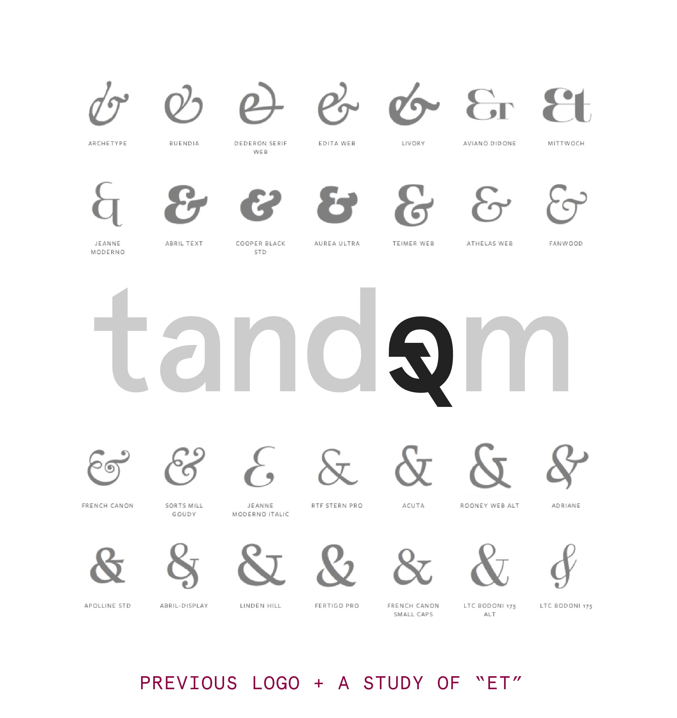
The most unique element in their previous logo is also the element where we saw the biggest opportunity for improvement: the “et” symbol that is used as the “e” in “Tandem”.
The “et” symbol is an old Latin cousin / predecessor to the “&” we see most commonly today, and the meaning behind it (”and” / “with” / “together”) is a perfect fit for Made in Tandem’s company name, spirit and purpose. However, the symbol used in their previous logo was not easily recognizable as an “et” or an “&”, so it didn’t convey this idea to viewers without a little help.
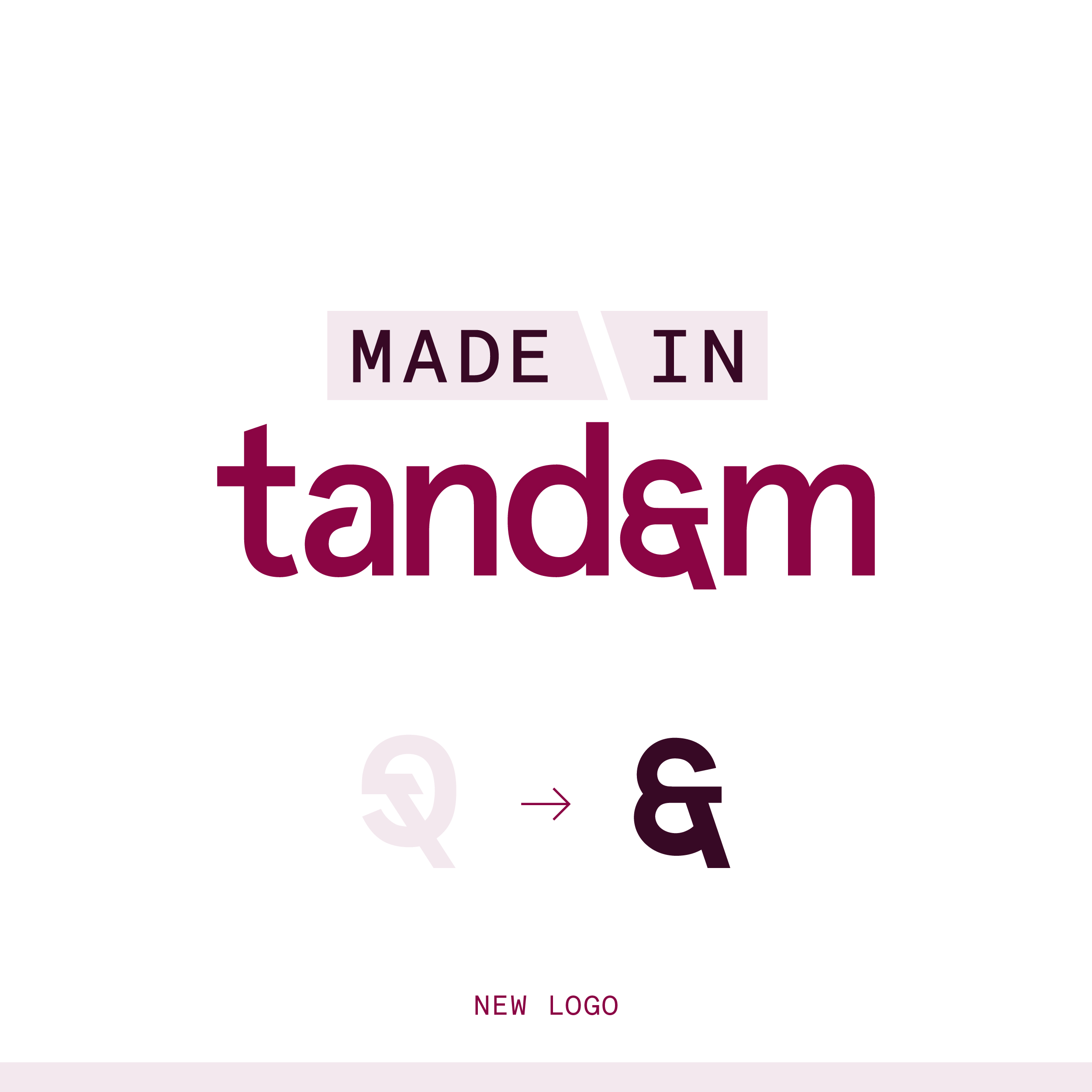
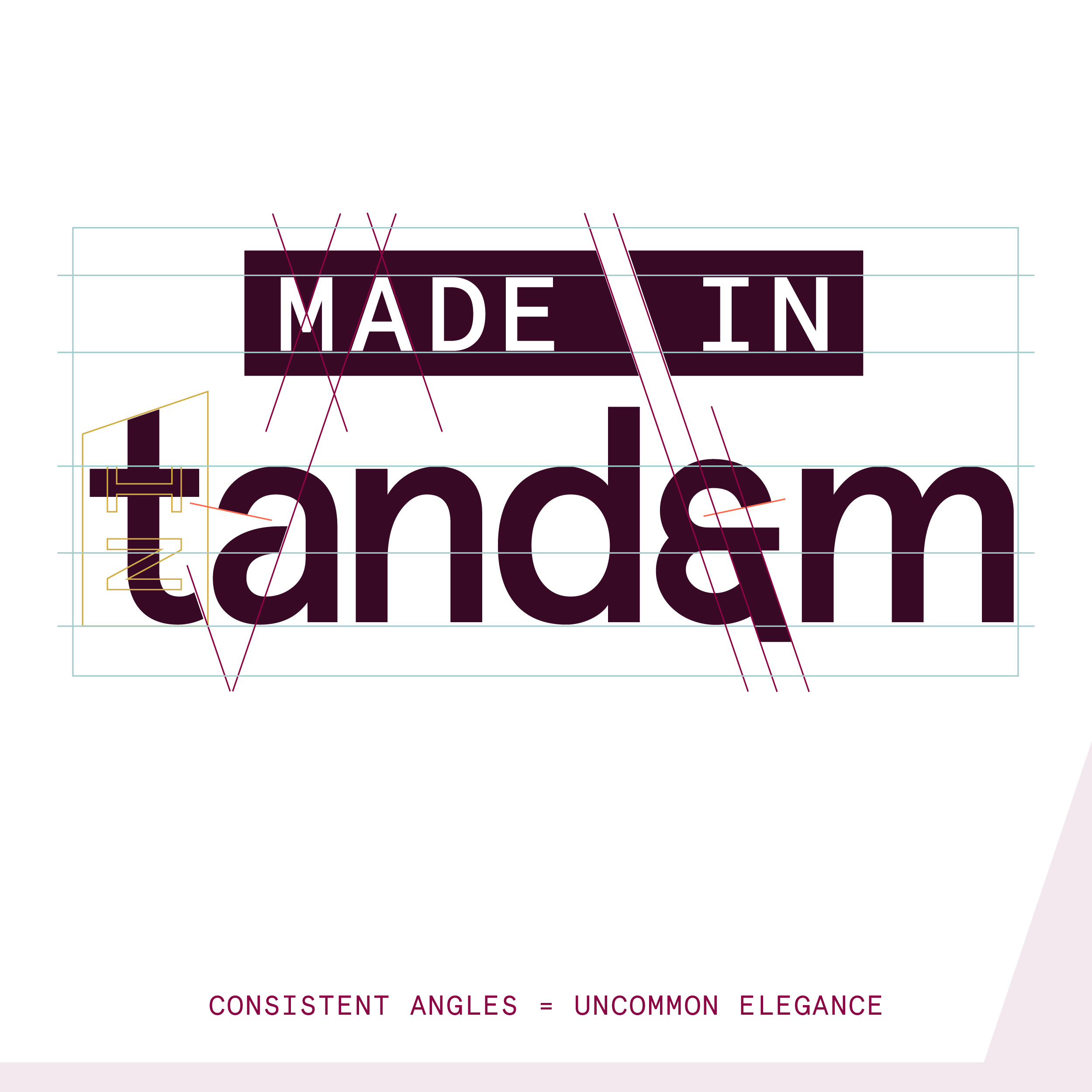
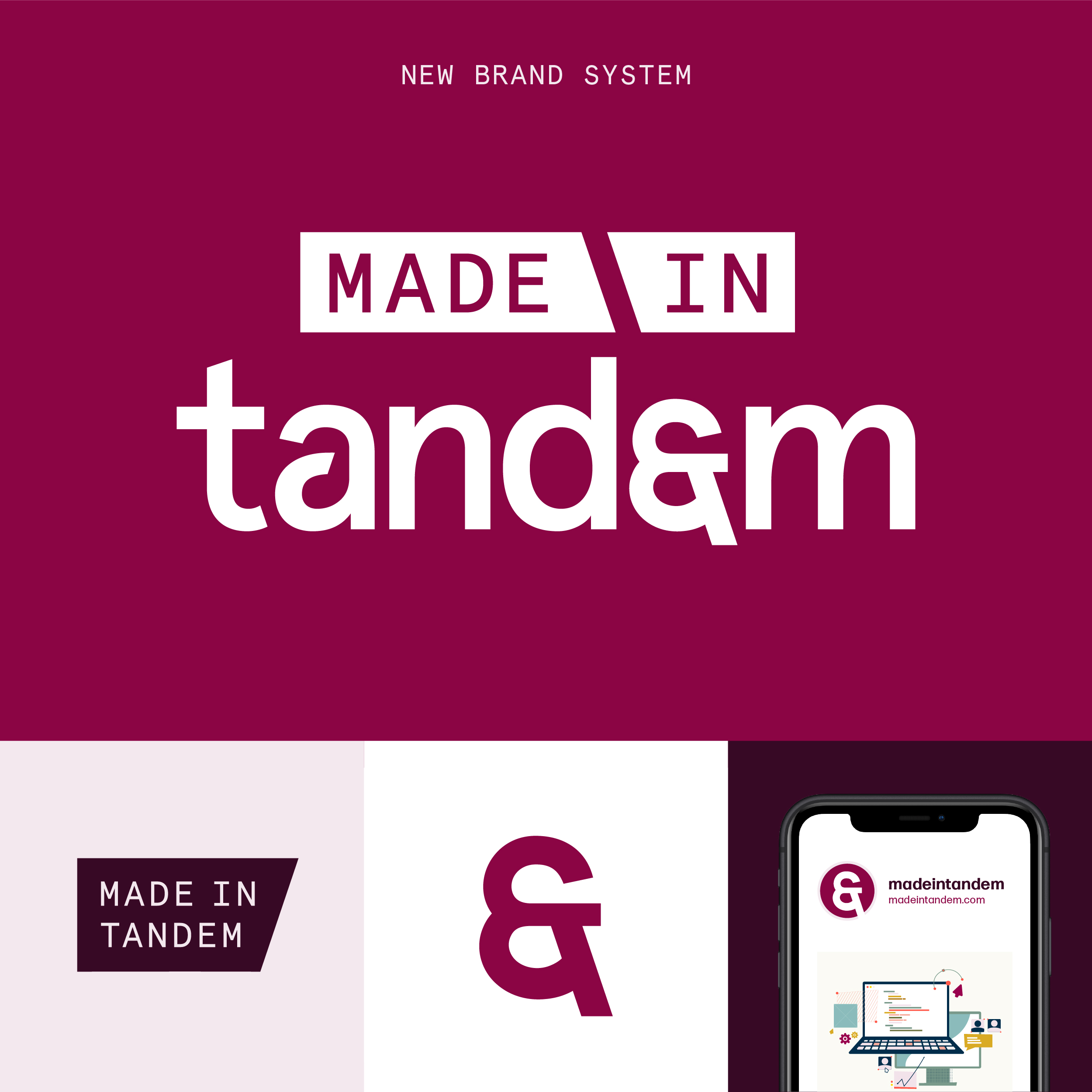
This new Made in Tandem logo keeps the familiar word “Tandem” in the spotlight, with a new-and-improved “et” symbol that reads more easily as both an “et” / “&” and as the “e” in the word “Tandem”. We added the words “Made in” to the logo in angled rectangles that match their existing brand style and evoke the ideas of collaboration, idea sharing, co-creating, etc. – like two cursors working together in real time in Figma or a similar platform.
We kept the angled lines parallel to one another throughout this logo so the various points all feel equally “sharp” and harmonious, and we condensed the letter spacing in the word “Tandem” juuust a bit for a tighter look.
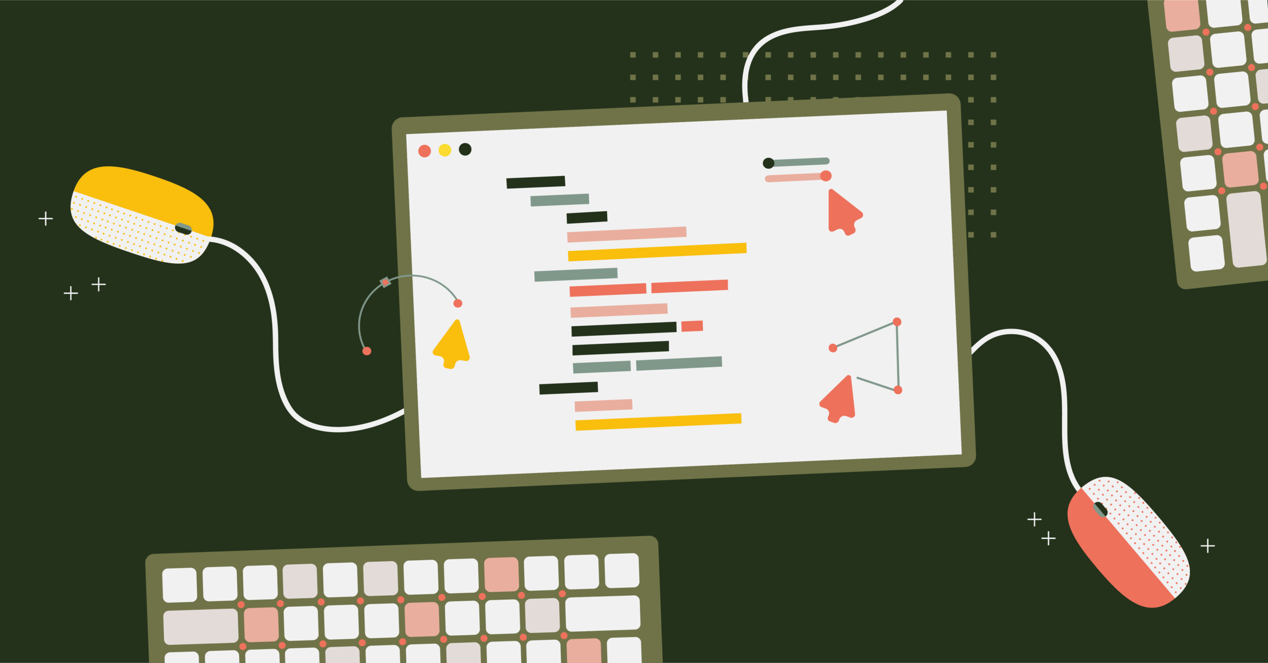
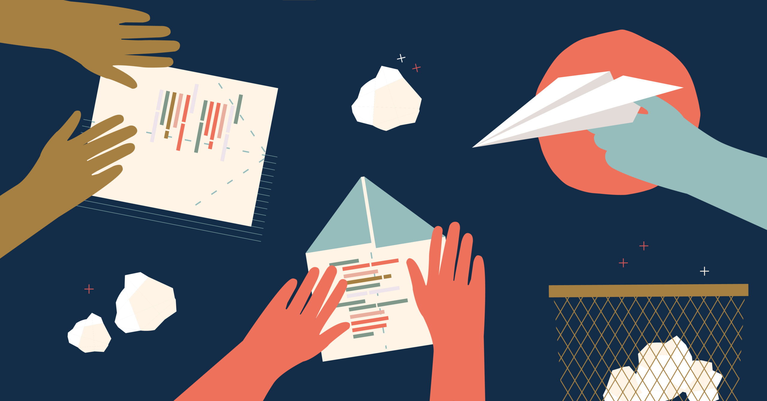
We’ve also worked with the Made in Tandem team on some custom illustrations and other brand elements, including the motion graphic at the top of their homepage!
Pen & Mug are so easy to work with. They’re proactive about communicating timeline and providing updates as the work is being completed. They met every deadline, responded quickly and clearly to my questions,
Carson H, Brand Marketing Manager @ Made in Tandem
View Another Project
