Find your fix
Sugar Fix Café

Introduction
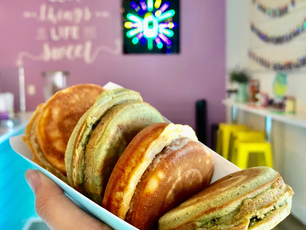
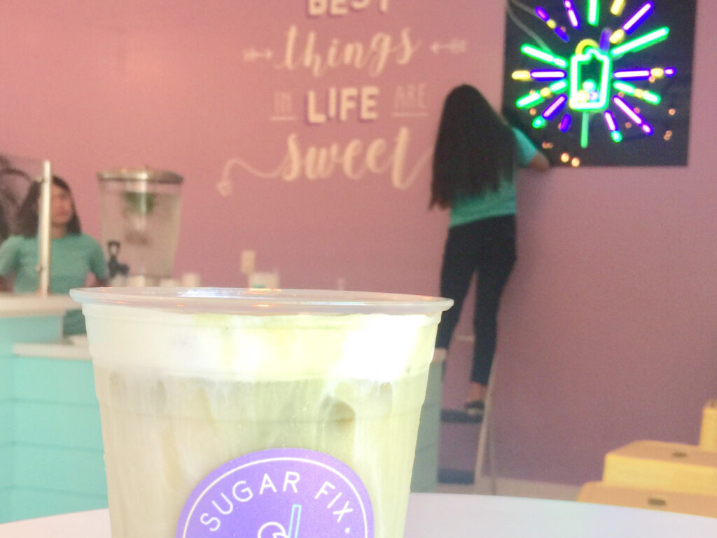
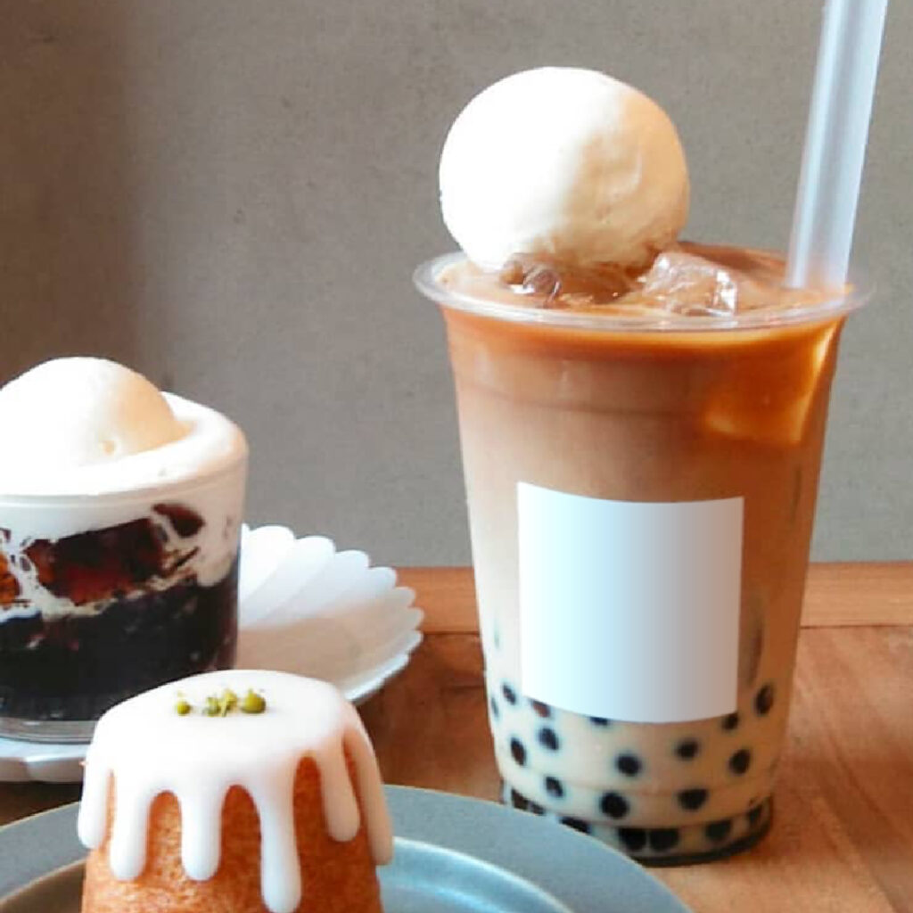
Sugar Fix Café is a hot spot right by California State University, Northridge that specializes in hand-crafted boba, espresso, and organic teas.
The owners knew they wanted their logo to depict one of their signature drinks in a clean, linear aesthetic, and hired us to help bring their vision to life. We took their initial design ingredients, replaced our afternoon coffees with boba teas for a few days (for research), and got to work exploring and experimenting with colors, forms, typography.
The Logo
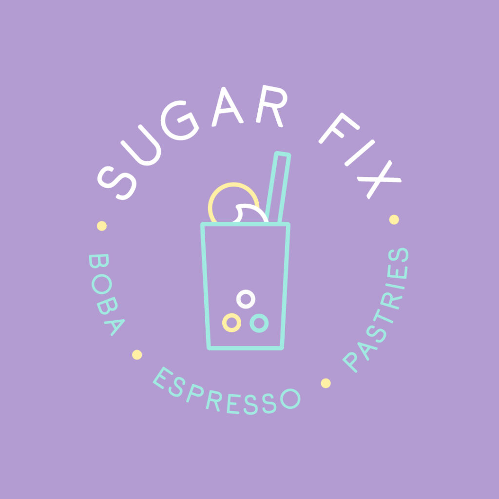
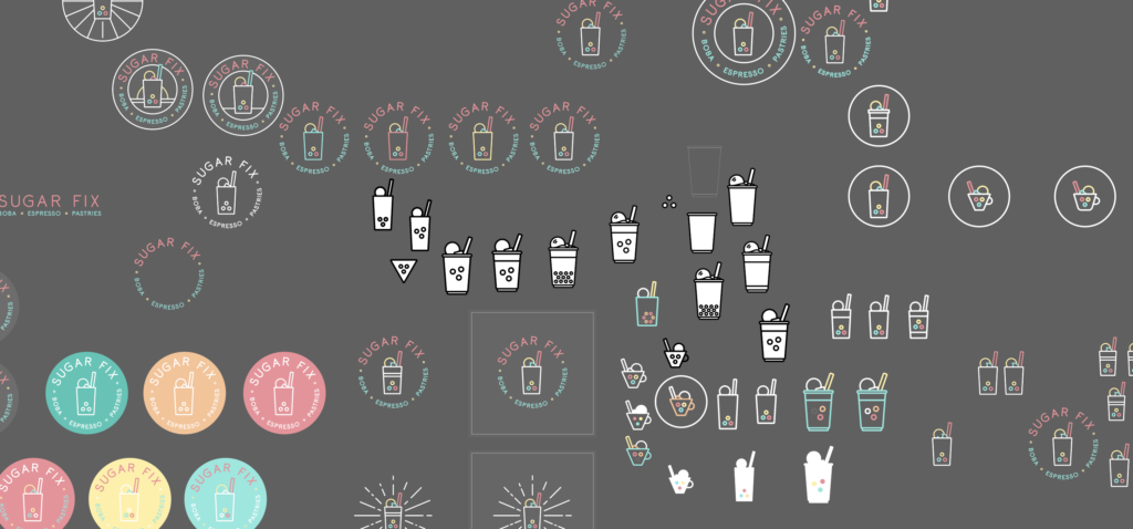
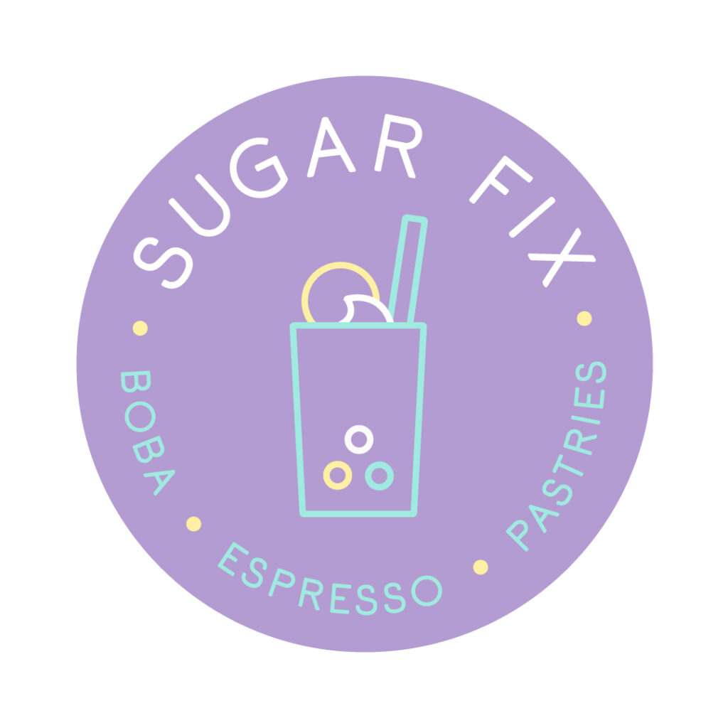
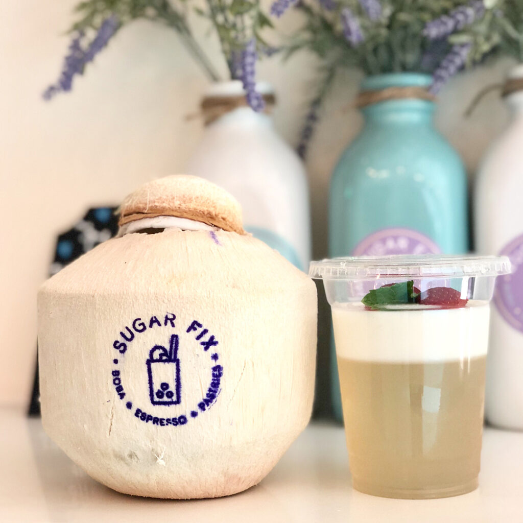
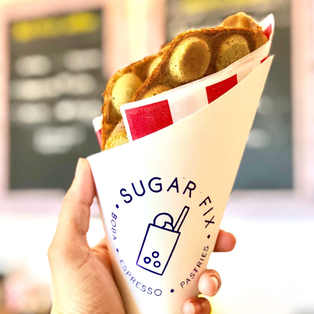
The final Sugar Fix logo has a sleek and minimal style, but is packed with subtle symbolism. The foundation of the logo is a drink cup in its simplest form with a wide straw, iconic of boba milk tea. Tri-colored boba is a Sugar Fix specialty, so we used three colors for the brand, and included three pearls of boba at the bottom of the cup. We took some liberty with those colors — tri-colored boba pearls are black, red and orange, but we exchanged those for three brighter, friendlier colors fit the SoCal cafe’s beachy atmosphere. You’ll see more elements of their coastal vibe in the wave of liquid at the top of the cup, and a floating scoop of vanilla ice cream that resembles the sun on the horizon.

When I came across Pen & Mug on Instagram, I knew right away that was the logo artist for our cafe. I loved the style, the design personality, and the general artistic vibes. I described what I had envisioned, and they brought everything to life! The experience exceeded all of our expectations! Every day people tell us how much they love our logo, and we couldn’t be happier with our choice to work with Pen & Mug!
Katrina Yuille, Co-Founder @ Sugar Fix Cafe
View Another Project